
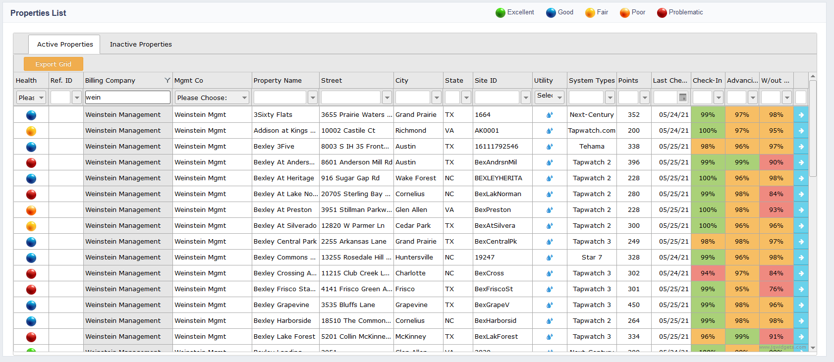
The Property List gives users a quick overview of the health of the communities, allows users to sort data, and is the gateway to a more detailed overview of each community.
A color coded health reference can be seen on the far left of the property list. This gives users a quick visual on the health of the community. It also allows users to sort data based on health status.
To sort based on health status, users need to hover over the health column and then click on the color representing the health status interested in.
Green represents less than 5% of units with issues or "excellent".
Blue represents 5%-10% of units with issues or "good".
Yellow represents 10-15% of units with issues or "fair".
Orange represents 15%-20% of units with issues or "poor".
Red represents more than 20% of units with issues or "problematic".
More detailed information can be found on the right hand side of the community. These columns can be sorted by clicking on the column header.
- Check-in represents the percent of communities able to check in or communicate with the data collector.
- Advanced represents the percent of communities advancing or showing consumption.
- W/out Errors represents the percent of communities without errors.
Within the Property List, users can filter their portfolio data for one specific property by clicking the top of the column to sort or by typing the name in the Quick Search Area.
To view a more detailed description of each property, double click on the property name or click on the blue arrow on the far right of the property.
Comments
0 comments
Article is closed for comments.